How to Choose Exterior Paint Colors: A Designer's Guide
By Joe Weagraff, Lead Designer at Butch & Co. | Columbus, OH
Choosing an exterior paint color might be the highest-stakes design decision a homeowner ever makes. It is the one everyone sees, it is expensive to redo, and you have to live with it every single time you pull into the driveway. No pressure, right?
Most people start in the wrong place: a paint chip. They fall in love with a color on a little card in the store, get it home, and cannot understand why it looks completely different on the house. The problem is that exterior color is never about a single color. It is about how a whole set of colors works with everything on your house you cannot change. This is the process a designer actually uses to get it right, and you can follow the same steps yourself.
Step 1: Start With What You Can't Change
Before you look at a single paint color, take inventory of the permanent elements. These are your fixed palette, and every paint choice has to work with them:
Brick or stone. This is the big one. Brick has strong undertones, often red, orange, pink, or brown, and your paint colors either flatter those undertones or fight them. You are not painting the brick, so the brick gets a vote.
The roof. A brown, gray, black, or weathered roof sets a temperature (warm or cool) for the whole house.
Natural surroundings. Mature trees, greenery, and the light your house gets all affect how a color reads.
Here is the mindset shift: you are not choosing colors in a vacuum. You are choosing colors that make your fixed elements look intentional instead of accidental. A warm orange-red brick, for example, can look dated and clashy next to the wrong color, and rich and welcoming next to the right one. Same brick, completely different result.
Step 2: Count Your Materials
Walk to the curb and count how many different materials and surfaces your house actually has. A typical home might have brick, siding, trim, soffits and fascia, shutters, a garage door, a front door, and porch posts. That is a lot of surfaces, and every one of them is a decision.
The more materials a house has, the more restraint the palette needs. When you have five or six competing surfaces, the goal is usually to simplify, letting most of them fall into one or two cohesive colors so the eye can rest, and saving contrast for the spots that deserve attention. A busy house painted in too many colors looks chaotic. A busy house unified with a smart, limited palette looks custom.
Step 3: Decide What Stays and What Goes
Paint is only part of an exterior refresh. Before you finalize colors, decide what you are keeping and what you are replacing, because those choices change everything:
Garage door: keeping the old one or replacing it? Its color and style anchor a huge part of the facade.
Light fixtures: dated fixtures can undercut a beautiful paint job. New ones (say, a modern brass or black sconce) can elevate the whole entry.
House numbers and hardware: small details, big impact on the finished look.
Shutters: keep, replace, or remove entirely? Not every house needs them.
Front door and porch elements: these are your best opportunities for a welcoming accent color.
Deciding these up front means your paint palette is designed around the finished house, not the current one.
Step 4: Factor in the Other Fixed Neighbors
A few more things you are not painting, but that your colors have to live beside:
Concrete. Your driveway, walkway, and porch slab all have a color, often a warm or cool gray, that sits right next to your paint.
Landscaping. Evergreens, mulch beds, and seasonal color are a permanent part of the picture.
Adjacent homes. You do not have to match the neighbors, but you do not want to disappear next to them or clash either.
Step 5: Build the Palette in Layers
Once you know your fixed elements, build the palette in three layers:
The field color. This is the dominant color, usually the siding, and it covers the most square footage. It should complement the brick and roof and set the overall tone.
The trim color. This frames the house, windows, and rooflines. Crisp trim is what makes a paint job look sharp and finished.
The accent color. This is where personality lives, on the front door, shutters, or porch details. It is the smallest amount of color doing the most emotional work.
Get those three layers in the right relationship and almost any house reads as pulled-together.
Step 6: Test Big, Test in Place, Test in Light
This is where the paint-chip method falls apart. Color changes dramatically with size, surroundings, and light. A color that looks perfect on a two-inch chip can look totally different across an entire wall, and different again at 8am versus 6pm.
So test the way professionals do:
Use large samples, not tiny chips. Big painted samples (or large peel-and-stick swatches) placed directly on the house tell the truth.
View them in place, next to your actual brick, roof, and concrete.
Watch them across the day, in morning light, harsh midday sun, and evening shade.
Consider digital renderings. Seeing your actual house mocked up in different color combinations before you commit takes enormous risk out of the decision.
Common Exterior Color Mistakes
A few patterns we see over and over, especially on Columbus's many mid-century brick homes:
Fighting the brick instead of working with it. The brick is staying, so the palette has to honor its undertones.
Too many competing colors. More materials call for less color, not more.
Sampling too small. A chip is a starting point, never a final decision.
Ignoring the fixed elements. Roof, concrete, and landscaping are all part of the composition.
Chasing a trend that will not last. Exterior paint is a long commitment. Timeless beats trendy.
A Real Columbus Before-and-After
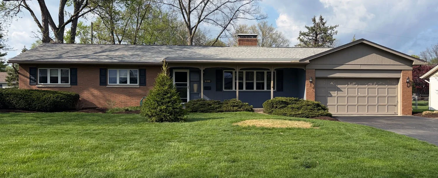
Before
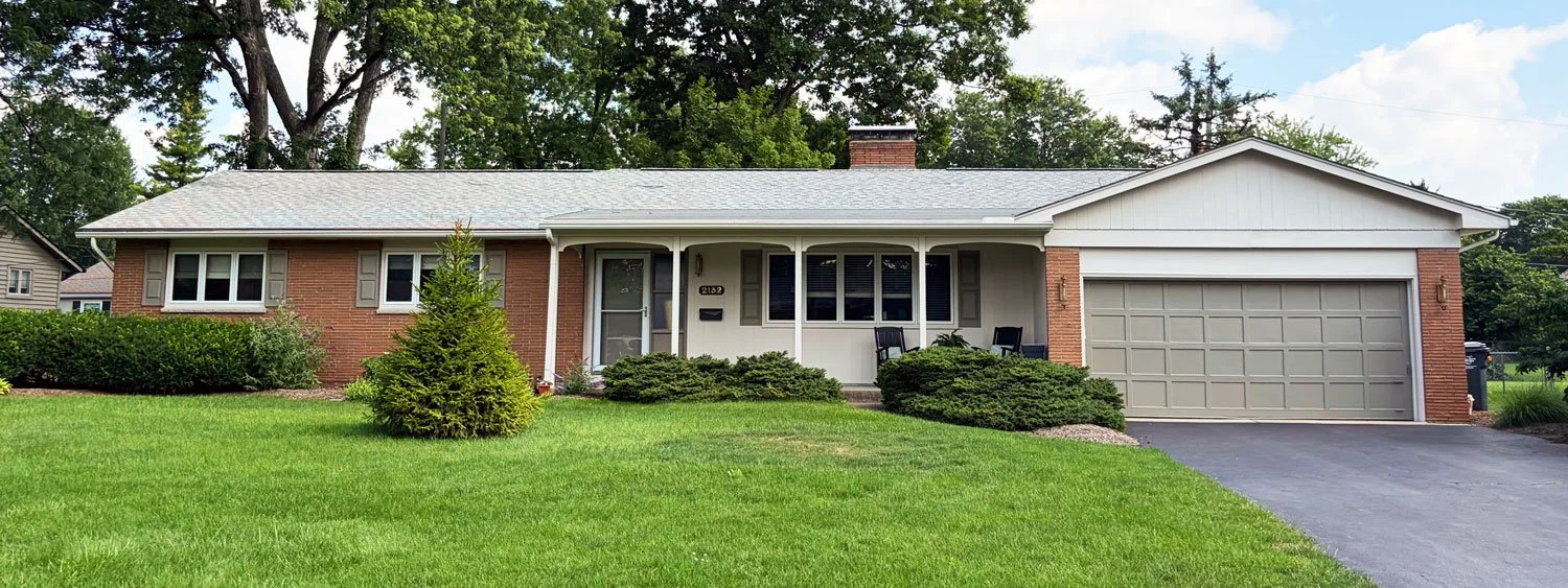
After
Here is a recent project that shows the whole process in action. The house is a classic Columbus brick ranch with a warm orange-red brick that, of course, was not going anywhere. The problem was everything around it: mismatched greige siding, black shutters that fought the brick, and a tired, peeling tan garage door. Nothing was working together.
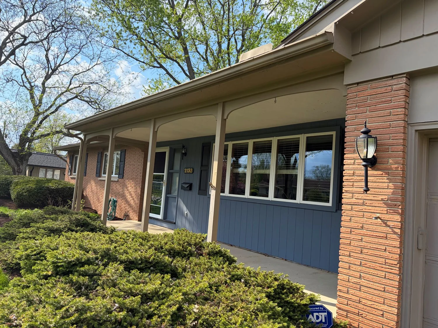
Before
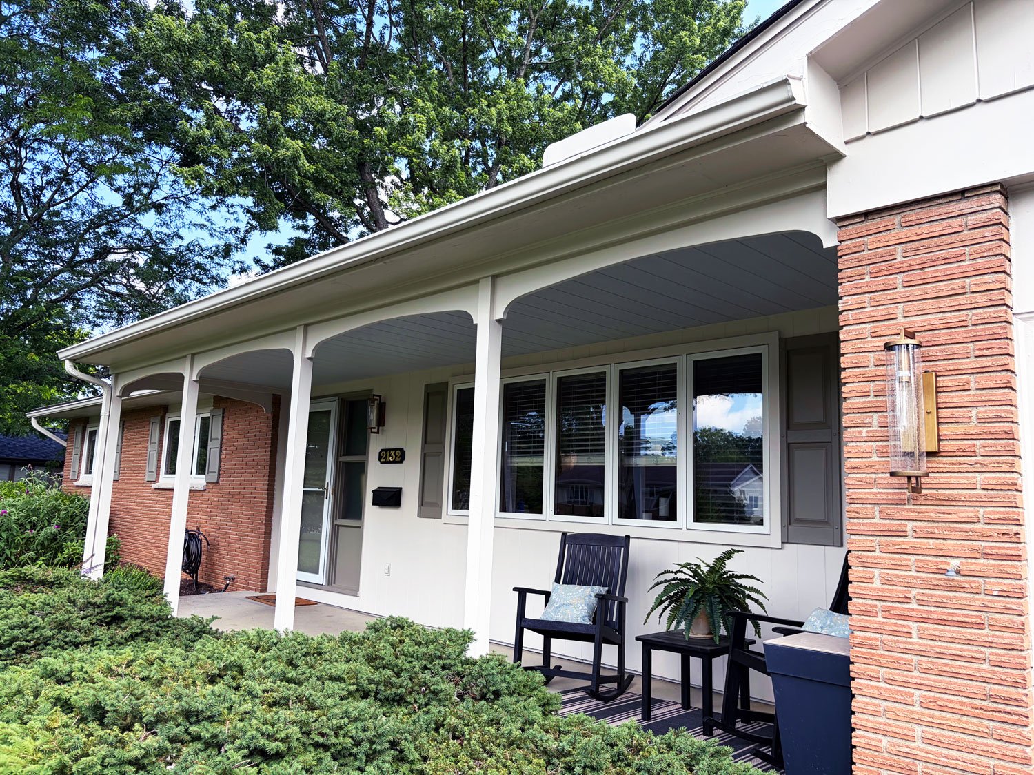
After
We started with what we could not change, the brick, and built outward from there. Instead of fighting that warm brick, we chose a soft, warm white for the siding and board-and-batten gables, which let the brick finally read as intentional and rich. Crisp white trim sharpened every roofline and window. We swapped the black shutters for a muted sage green that picks up the landscaping and softens the whole facade, replaced the dated exterior lights with modern brass sconces, and refreshed the porch, posts, and details.
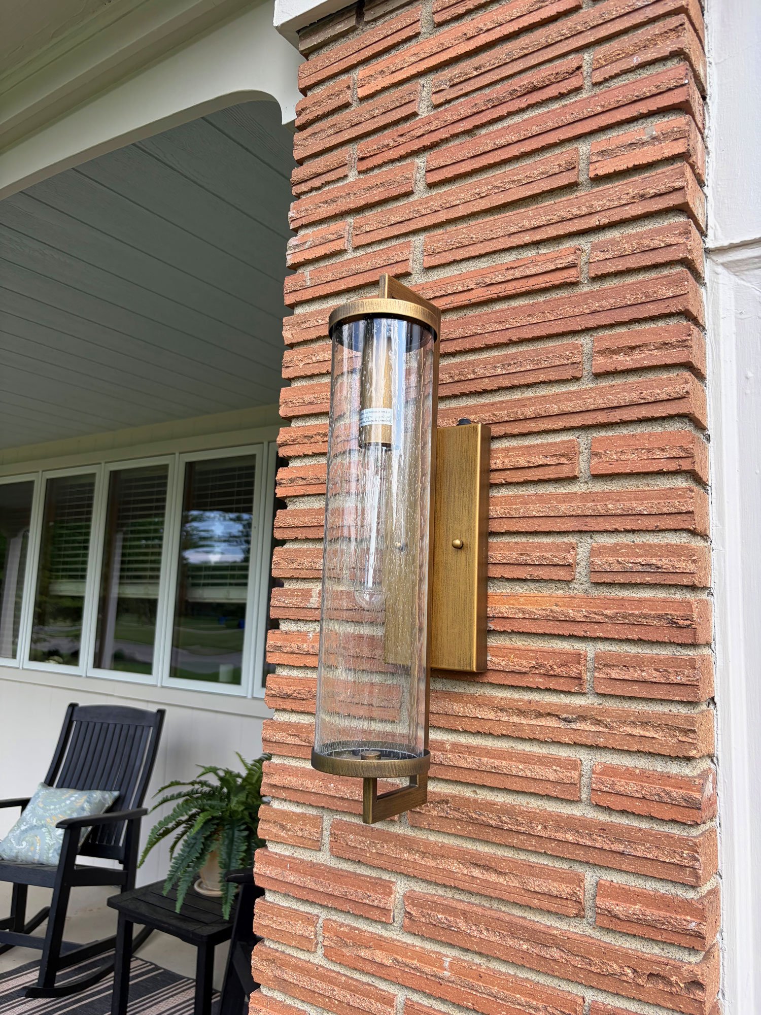
New brass light fixtures flank garage.
The brick is exactly the same brick. But by getting the surrounding palette right and making smart keep-or-replace decisions, the house went from dated and disjointed to warm, current, and cohesive, without changing a single permanent material.
When to Bring in a Color Consultant
You can absolutely work through these steps yourself. But exterior color is high-stakes and hard to visualize, which is why a professional color consultation exists. A good one is a real conversation, usually about an hour with the homeowner, walking the house together to read its materials, figure out what you love and what you do not, decide what stays and what goes, and then either mock up digital renderings or view large paint samples in place before anyone opens a can of paint.
At Butch & Co., that color consultation is included with every exterior painting project, because in our experience the color decision is the project. Get it right and everything else follows.
Frequently Asked Questions
How do I choose exterior paint colors for a brick house? Start with the brick, since you are not changing it. Identify its undertones (red, orange, pink, or brown) and choose siding, trim, and accent colors that complement those tones rather than clash with them. Then test large samples directly against the brick in natural light.
How many colors should a house exterior have? Most homes look best with three: a dominant field color, a trim color, and an accent for the door or shutters. Houses with many materials usually need fewer colors, not more, so the facade reads as unified.
Why does my paint chip look different on the house? Color changes with scale, light, and surroundings. A small chip viewed indoors will look different across a large wall next to your brick, roof, and concrete, and different again at various times of day. Always test large samples in place.
What is an exterior color consultation? It is a professional walkthrough, typically about an hour, where a designer reads your home's fixed materials, learns your preferences, helps you decide what to keep or replace, and provides digital renderings or large in-place samples so you can choose colors with confidence.
Do I need a color consultation, or can I do it myself? You can follow the same steps a designer uses, but a consultation removes the guesswork and the risk of an expensive mistake, especially on homes with brick, stone, or multiple materials.
Getting It Right the First Time
Exterior paint is one of the most transformative things you can do to a home, and one of the most expensive to get wrong. If you are in Columbus, Upper Arlington, Dublin, Hilliard, or nearby and want a designer's eye on your color choices before you commit, we would love to help. Our exterior color consultation comes standard with every exterior painting project.